The photoproof.io brand
How to use our name, logo, colours, type and product language. For press, partners, directories and anyone writing or designing for photoproof.io.

About the brand
photoproof.io is the modern contact sheet.
For about a century, photographers picked frames by circling them on a contact sheet with a china marker. photoproof.io does that same job online: a client circles the keepers, signs off, and you deliver. Nothing else in the way.
The brand borrows that ritual and nothing more. Black and grey for the film rebate and the paper. One marker colour, used only for the circle. Frame numbers in a monospaced face. The rest gets out of the way of the photos.
| On the contact sheet | In photoproof.io | How it looks |
|---|---|---|
| Circling a frame | Select | The hand-drawn lime circle |
| Crossing a frame out | Reject | A grey ✕ and a faded frame |
| A note in the margin | Comment | A graphite note on the frame |
| Signing the sheet | Confirm | The selection locks, with a timestamp |
| The number on the film edge | Photo code | LO_2041 in JetBrains Mono |
Describing photoproof.io
photoproof.io is online photo proofing software for photographers: share one link, and clients select, reject or comment on each photo and confirm their picks without creating an account, then you deliver the full-resolution finals from the same gallery.
Please use this description word for word in listings, directories and press. Shorter version (under 160 characters): “Photo proofing software for photographers. Share one link: clients select, reject, comment and confirm. Then deliver the finals. No client logins.”
Slogan
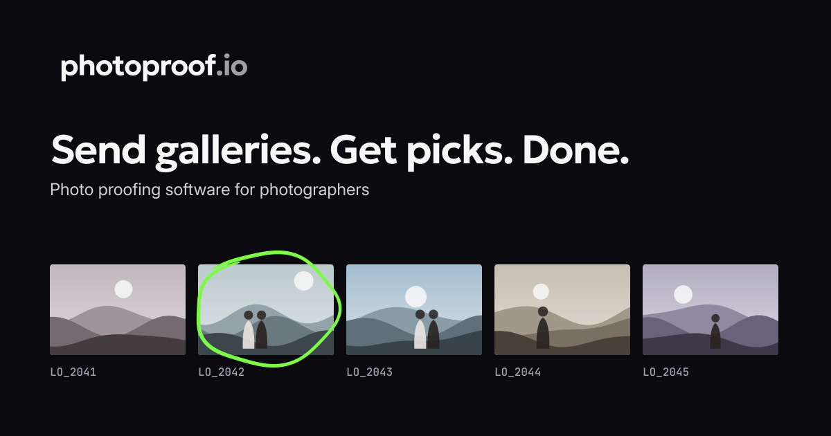
Send galleries. Get picks. Done.
Campaign lines
Circle the keepers.
Mark it. Confirm it. Done.
Writing the name
Always photoproof.io: lowercase, one word, with “.io”, even at the start of a sentence.
Never “PhotoProof”, “Photo Proof”, “Photoproof” or “PP”.
What we stand for
Focused
Two jobs done well: proofing and delivery. We say clearly what we don’t do.
Clear decisions
A circle for every Select, a live counter, a grey ✕ to Reject, and Confirm signs off the sheet.
Zero friction for clients
One link, no account, works on a phone.
Safe proofs
Password, watermark, download lock, view and download tracking.
Logo
The logo has two parts that can be used together or on their own: the wordmark and the icon.
Wordmark
“photoproof” in Geologica SemiBold, with “.io” in graphite on light and grey on dark. Use the supplied artwork; don’t retype it.


Icon
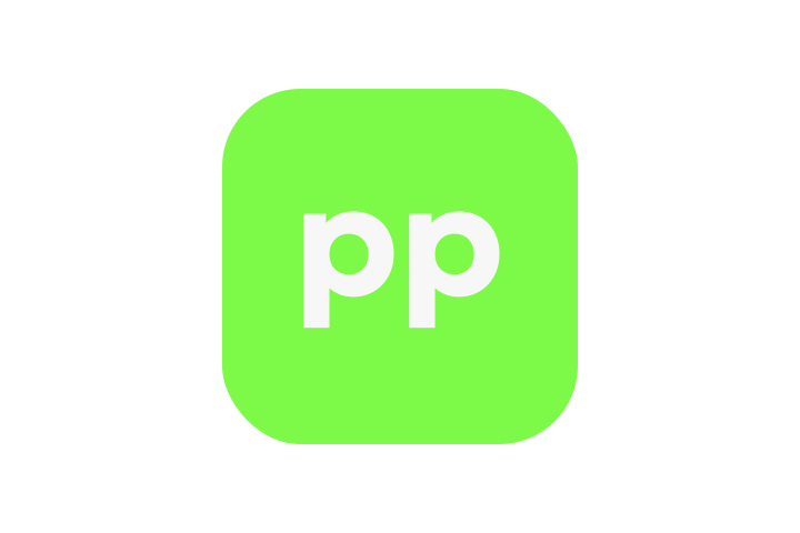
A lowercase “pp” in paper on an ink rounded square, with one open, hand-drawn lime circle. The square is always ink.



Clear space
Keep at least 25% of the icon’s size free on every side. Nothing else enters that area.
Minimum sizes
Icon with circle: 40 px and upPlain icon (no circle): 16–32 px, e.g. favicons and browser tabsWordmark: 80 px wide minimumAt 32 px and below the circle would blur, so use the plain icon.
Wordmark with circle
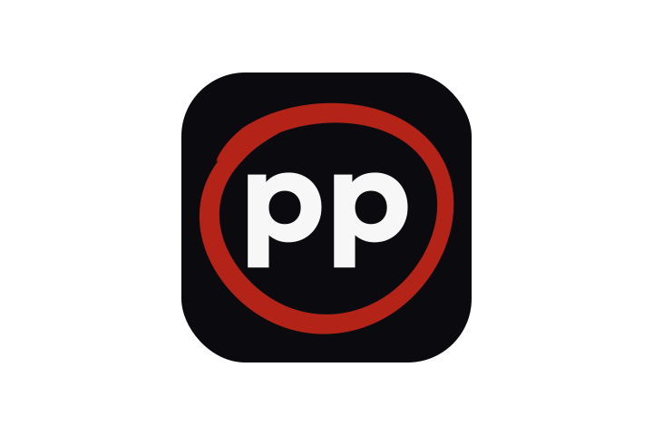
A variant with the circle around “proof”, for large hero, social and print uses only. Never in navigation bars. No outline on the circle.


Rules
- Use only one circle per composition.
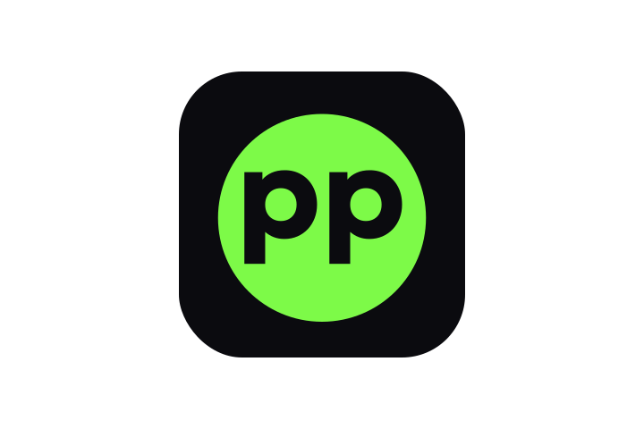
- The circle is never used on its own as a logo. It always goes with the “pp” monogram or the wordmark.
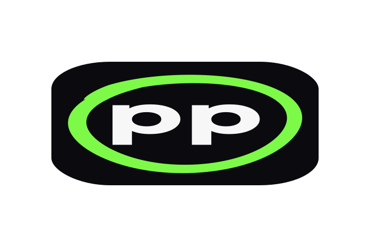
- The two p’s always sit side by side with a visible gap.
- Use ™ where a mark symbol is needed; never ®.
Logo misuse
Examples of what not to do. These images are deliberately wrong.


Colour
Black, greys and paper, with one neon lime that only ever means “selected” or “focused”.
Proportion
Paper and white dominate, ink carries text and buttons, greys do the supporting work. Lime and red are tiny by design.
Indicative share in a typical layout, not a strict quota.
Rules
- Lime appears in exactly three places: the selection circle, the focus ring and the circle in the icon.
- All buttons are ink on light backgrounds, and paper with ink text on dark.
- Red #B42318 is only for errors and Delete, always with an icon and words.
- Reject is always a grey ✕, never red and never lime.
- Never rely on colour alone: every state also has an icon, text or an accessible label.
Never
- Lime as text, a button, a badge, an underline or a background.
- Lime pages, cards, bands or hero areas.
- Yellow or gold accents, or blue near the mark.
- Gradients or tints of the lime.
Text contrast
| Pair | Text / background | Contrast | |
|---|---|---|---|
| Aa | Ink on paper | #0B0B0F / #F7F7F8 | 18.35:1 |
| Aa | Ink on white | #0B0B0F / #FFFFFF | 19.64:1 |
| Aa | Graphite on paper | #5B5B61 / #F7F7F8 | 6.30:1 |
| Aa | Graphite on white | #5B5B61 / #FFFFFF | 6.74:1 |
| Aa | Paper on ink | #F7F7F8 / #0B0B0F | 18.35:1 |
| Aa | Paper on dark grey | #F7F7F8 / #2A2A30 | 13.32:1 |
| Aa | Frame grey on ink | #A1A1AA / #0B0B0F | 7.66:1 |
| Aa | Frame grey on dark grey | #A1A1AA / #2A2A30 | 5.57:1 |
| Aa | Light grey on dark grey | #E4E4E7 / #2A2A30 | 11.24:1 |
| Aa | Error red on white | #B42318 / #FFFFFF | 6.57:1 |
| Aa | Paper on error red (Delete on dark) | #F7F7F8 / #B42318 | 6.14:1 |
Every text pair above meets WCAG AA (4.5:1) for body text.
Typography
Three open-source families, all with Latin and Greek: Geologica for headlines, Inter for reading, JetBrains Mono for numbers.
Κυκλώστε τις καλύτερες.
Clients select, reject or comment on each photo, then confirm. Οι πελάτες επιλέγουν, απορρίπτουν ή σχολιάζουν κάθε φωτογραφία.
LO_2041 · 3 / 40 selected · 16 Oct 2026, 14:02
| Style | Specification |
|---|---|
| H1 | Geologica 600, 48 → 60 px, line-height 1.0, tracking −0.03em |
| H2 | Geologica 600, 30 / 24 px, tracking −0.02em |
| Lead | Inter 400, 18 px, graphite |
| Body | Inter 400, 16 px / 1.5 (long text 1.7, max 72 characters per line) |
| Small | Inter, 14 / 12 px |
| Codes | JetBrains Mono, 13–14 px |
Using the fonts
- All three are licensed under the SIL Open Font License, so you can use them freely.
- On the web, self-host them as WOFF2 (Latin, Latin Extended and Greek subsets).
- Fallbacks: Geologica → Inter → system sans; JetBrains Mono → system monospace.
- Use sentence case. Avoid ALL CAPS in body text.
The selection circle & photo states
The circle is the heart of the brand: the marker a client draws around a keeper. Try it: click a frame.

16 Oct 2026, 14:02Selection lockedStates
- Selected: the photo keeps full colour and gets the hand-drawn lime circle. 6.4 px on light, 4 px on dark, never filled, no outline.
- Rejected: a grey ✕ and the photo greyed out (50% opacity, no colour). Never red, never lime.
- Comment: a graphite speech-note icon with a count.
- Counter: JetBrains Mono, e.g. “3 / 40 selected”.
- Confirmed: an ink strip with a lock, “Signed off” and a timestamp. The selection becomes read-only.
Rules
- No “Selected” or “Rejected” labels or pills on photos. The circle and the ✕ are the only marks.
- Screen readers get each state from the markup (for example aria-pressed and a label such as “LO_2042, selected”).
- The selected count is always visible as text.
- The circle may draw in on Select (250 ms or less). With reduced motion, it simply appears.
- The circle only marks a selected photo and sits in the icon. It is never page decoration.
Buttons, messages & focus
Every button is ink. Red is kept for errors and Delete. Lime marks keyboard focus.
On light
Primary: ink with paper text, hover dark grey, 6 px radius. Confirm is the same button at weight 600 with a check icon. Secondary: transparent with a light grey border. Delete: red text, red border and the trash icon.
On dark
The main button is paper with ink text. Secondary has a graphite border. Delete is a red fill with paper text.
Focus ring
Light: a 2 px ink ring plus a 2 px lime outer ring. Dark: a 2 px lime ring. Both sit 2 px away from the control and follow its shape, so focus never looks like the hand-drawn circle. Press Tab on this page to see it.
Messages
It will not be delivered. Remove it, or ask the client to add it.
Success messages are ink with paper text. There is no green or lime “success” colour.
Iconography
Interface icons come from Lucide: simple outline icons on a 24 px grid with rounded ends.
checkxmessage-squarelocktrash-2triangle-alertuploadsendeyedownloadmailclockRules
- Stroke 1.75–2 px at 24 px, round caps and joins. Don’t mix in filled or other icon styles.
- Icons are ink or graphite (paper or light grey on dark), never lime.
- Pair icons with a text label wherever the action isn’t obvious.
- Delete always uses trash-2; errors use triangle-alert.
Lucide is open source under the ISC licence.
Imagery
Real photographs, shown the way a photographer sees them: framed, numbered and ready to choose.






Illustrative placeholder frames.
Do
- Show photos in frames: thin ink rebates on dark layouts, white mats on light.
- Show choice: sequences, near-duplicates, several angles of one product.
- Keep colour true to life, with natural or softbox light.
- Use only the brand’s own marks on photos: the lime circle (Select), the grey ✕ (Reject), a graphite note (Comment) and the signed-off strip (Confirm).
- Write alt text that says what is shown, including which frames are circled.
Avoid
- Generic stock photography, or a camera as the hero image.
- AI-generated people.
- Heavy filters, HDR, vignettes, fake film grain or light leaks. The idea is the contact sheet, not a retro filter.
- Identifiable people or property without releases, or client work without written consent.
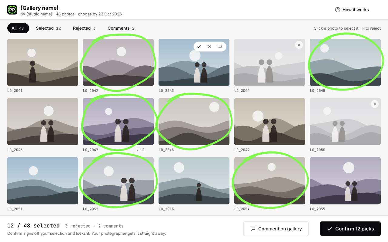
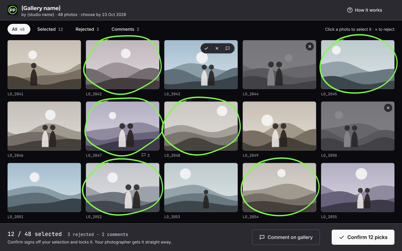
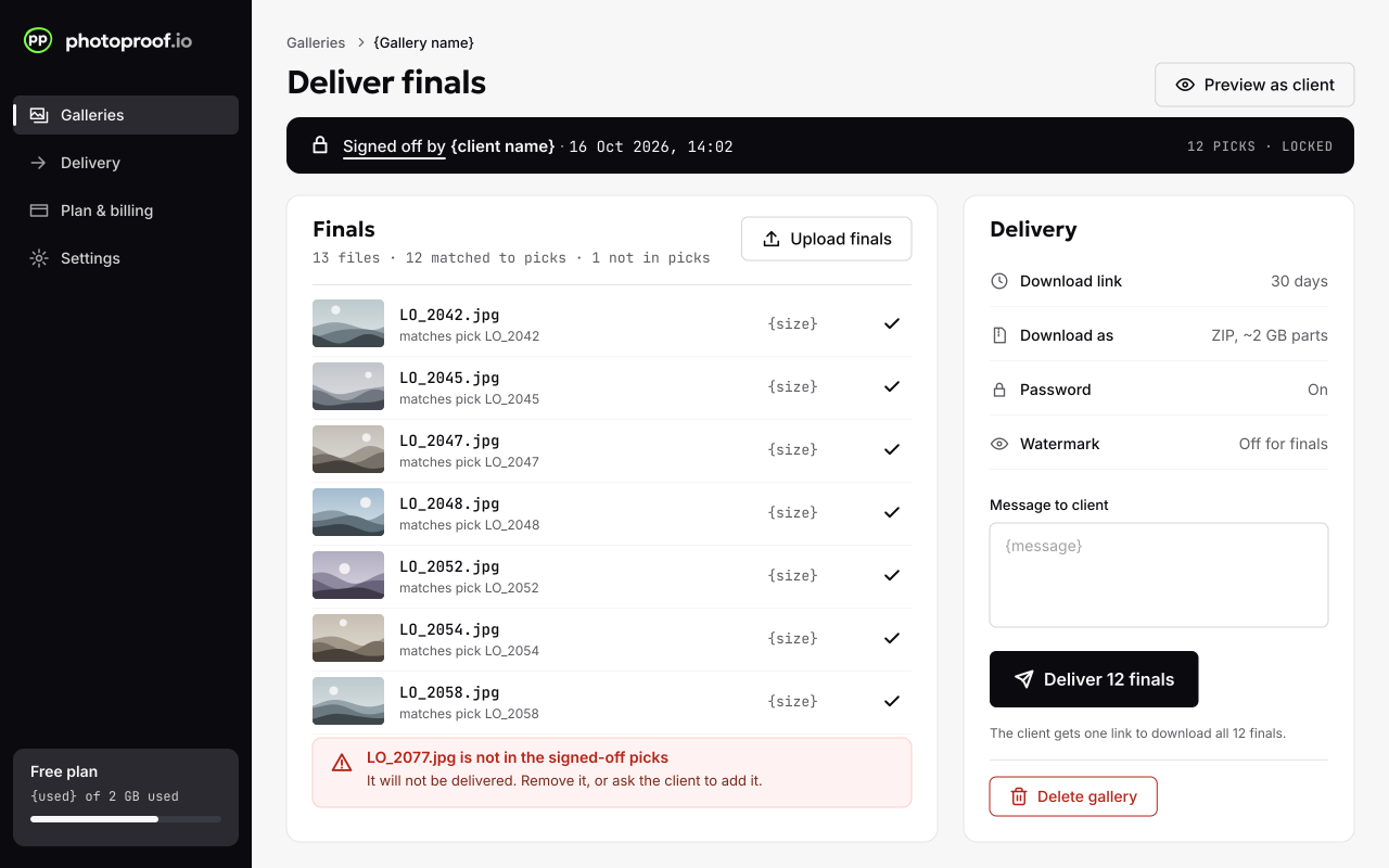
Product screenshots come from a demo account with placeholder images, and say so.
Voice & tone
Plain, short, practical and honest, with a photographer’s vocabulary. A competent colleague, not a hype marketer.
Sample lines
The four client actions
Use these words everywhere: site, app, social and listings. “Circle” is fine for the look of a selection (“3 of 40 circled”), but the button is always Select. Never “tick”, “star”, “favourite”, “like” or “approve”.
Spelling is British-leaning: “favourites”, “customisable”.
Applications
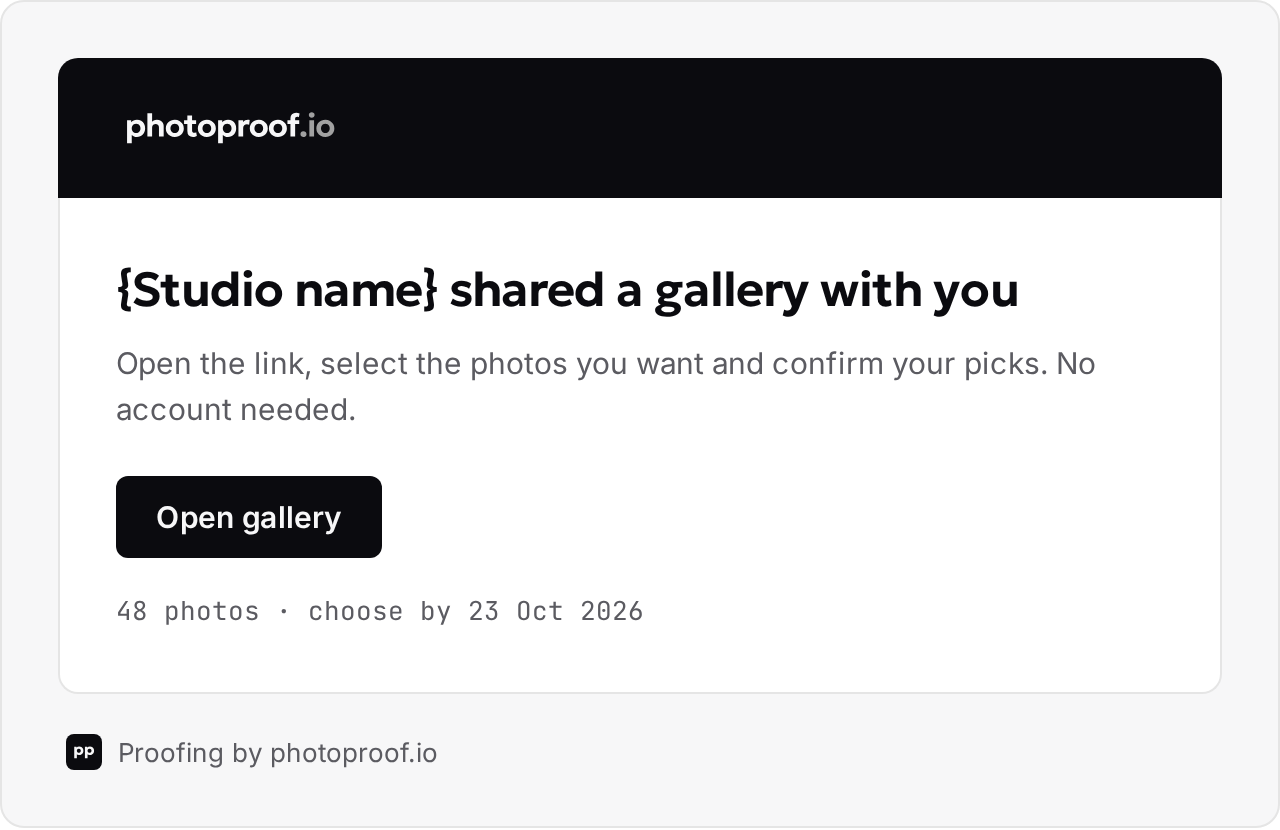
How the system comes together. All of these are examples; the product screens use a demo account with placeholder images.
Downloads
Use these files as they are. Please don’t redraw, recolour or rebuild the logo.
All logo files below (SVG + PNG), with a short usage note
230 KBphotoproof-brand-guidelines.pdfThese guidelines as a PDF (A4 landscape)
1.5 MBIndividual files
photoproof-icon.svgIcon, plain (≤ 32 px), SVGphotoproof-icon-plain.svgIcon, 512 × 512 PNG
photoproof-icon-512.pngIcon, 192 × 192 PNG
photoproof-icon-192.pngIcon, 180 × 180 PNG
photoproof-icon-180.pngIcon, plain 32 × 32 PNGphotoproof-icon-32.pngIcon, plain 16 × 16 PNGphotoproof-icon-16.pngWordmark for light backgrounds, SVGphotoproof-wordmark-on-light.svgWordmark for light backgrounds, PNG
photoproof-wordmark-on-light.pngWordmark for dark backgrounds, SVGphotoproof-wordmark-on-dark.svgWordmark for dark backgrounds, PNG
photoproof-wordmark-on-dark.pngWordmark with circle, light, SVGphotoproof-wordmark-circle-on-light.svgWordmark with circle, dark, SVGphotoproof-wordmark-circle-on-dark.svgWordmark with circle, light, PNG
photoproof-wordmark-circle-on-light.pngWordmark with circle, dark, PNG
photoproof-wordmark-circle-on-dark.pngWordmark PNGs are 1600 px wide with transparent backgrounds. The 32 and 16 px icons are the plain version, without the circle.
Press & brand questions
Need a format that isn’t here, or want to check a use of the logo? Write to us.
hello@photoproof.io